
Tuesday, March 25, 2014
LIDAR: Ground Zero
Doppler Radar: Today's Weather

Infrared Aerial Photo: Avon Park

Cartographic Animation: Hurricane Charlie

Cartographic animation maps are maps that portray information through motion and movement over a specific area. These maps rely on information over a specific period of time. They are often used in weather forecasting. The map above is a cartographic animation of Hurricane Charlie hitting Florida in 2004. The image spans over a few hours and shows the progression of Charlie over time.
Cartogram: CO2 Production

Cartograms are a type of Thematic map that express a specific variable of an area. They often express statistical information collected over a certain period of time. The map above shoes the carbon monoxide production in the world. By distorting the countries to fit their production of carbon monoxide, the cartogram is able to offset the way we usually look at the world and relay vital information. The bigger the country, the more carbon monoxide it produces each year.
Monday, March 24, 2014
Flow Map: Immigration

Flow maps in cartography are designed to show the path or flow of specific data and the movement involving a specific area. In this map, the movement of immigration into the United States. There is a grid on the side expressing the different percentages. Also, the size of the arrow indicate the amount of immigrants and the shading of the states in the United States show the highest density of immigration.
Isoline Map: Australia

Isoline maps are a maps that express anything from temperature and air pressure to elevation by use of lines that connect at the end. An example of this is isothermal lines used to express temperature, like the map above. This map expresses the average temperature in Fahrenheit in the month of January in Australia.
Proportional Circle Maps: Most Populated Cities

Proportional circle maps portray data using circles sized proportionally to the relevant data. The larger the circle, the larger the number the circle represents. In this proportional circle map the largest cities int he world are depicted by the size of the circle and then colored a different color based on their importance.
Choropleth Map: Australia

Choropleth maps are a type of thematic map that express population or any other characteristic through shading and/or proportional relations between specific regions. According to the source, the choropleth map makes it easy to decipher the designated information between areas. For example, in the map above of Australia the percentage of the population that takes part in the Anglican religion. The darker the shading the higher the Anglican population. The lighter the shading, the smaller the Anglican population.
Dot Distribution Maps: United States

Dot distributions use dots or other symbols to represent a certain characteristic of a specific area. They can also represent different events or that occurred in a specific region. In this dot distribution map, each dot represents 7,500 people. Here you can see the most populated places and areas of the United States.
Propaganda Map: British View of Europe

Propaganda maps are maps intended to evoke a feeling or showing the world the way a region, government, map maker, religion, or anyone sees the world. They can take on the political beliefs of a government and can cause movements. They are made to cause a reaction for a specific reason. In this map, the british opinion of Europe at the beginning of World War 1. These maps can often convey an opinion in a humorous way.
Hypsometric Map: United Kingdom

Source: http://www.scilands.de/e_index.htm?page=/e_service/e_downloads/e_shaded_maps/shaded_maps.htm
Hypsometric maps are similar to topographic maps in that they display elevation. However, in the case of hypsometric maps, they utilize shading and coloring to display the different heights over a specific area. In most hypsometric maps green is a reference to a flatter area and as the color shading fades all the way to red being the highest elevation in this region. Depending on the maps and the region being depicted the color scheme and scale will vary. In this hypsometric map of the United Kingdom and Ireland, the highest elevations are depicted in red and mostly located in Scotland where as the flatter, bright green areas are in the middle of Ireland and the south eastern part of Great Britain. If you look the the far west in Ireland, you can see the high, dark yellow elevations of the Cliffs of Moher outside the city of Gallway.
Cadestral Map: Los Angeles, California

Cadestral maps are maps that display real-estate or different land ownerships of a particular region. By using coloring and shading these maps are able to establish type of land and who the owner is, whether it be state or privately owned. In this cadestral map of the city of Los Angeles, different colors represent different land types, for example, green is rural, blue is water. If you go to the web page where this image is located you can zoom in on any particular area and read who owned this land during the time this map was made.
Topographic Map: The Himalayas

Topographic maps are maps that help to display elevation. They often use contour lines to express the different elevations and slopes of various landscapes. In this particular topographic map of the Himalayan mountain range, Ararat is being depicted. With contour lines, the closer together the steeper the slope, the farther apart, the gentler the slope. Looking at the peak of the mountains shown, the lines are so close together at times that it looks blurred together. Towards the bottom of the mountain the lines are more spread out indicating the decline in elevation and slope.
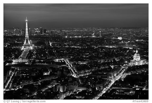
Black&White Aerial Photo: Paris, France

Source: http://www.terragalleria.com/black-white/europe/paris/eiffel-tower/picture.fran42469-bw.html
Aerial photos are photographs taken at an angle 3/4 of the way up. It conveys an overlook of a specific area. Aerial photographs qualify as maps because it provides a unique perspective of a region that would not be attained by any other map or drawing but allows a visual aspect of a city or region. By taking an aerial photograph of Paris, France you are highlighting major roadways and landmarks, like the Eiffel Tower and making the location easy to identify.
Subscribe to:
Posts (Atom)